Redesigning a popular e-commerce iOS App used for buying and selling clothes
Depop Redesign

Role
UX/UI designer
Overview
Depop is a popular e-commerce app among Gen Z users which serves as a marketplace for new and used clothing items. A few key changes to the UI are needed in order to resolve key pain points as well as boost the app’s aesthetics.
Duration
3 weeks
Tools
Sketch
Team
Individual
THE CHALLENGE
An app that offers a more logical flow and visual cues for seamless time tracking and notifications
Identify pain points of a popular iOS app and create new interface in order to boost Depop engagement and revenue.
THE OUTCOME
I conducted user research on 12 students at my university ranging in ages 19-23 who know what Depop is but are unfamiliar with the Depop interface (not users of Depop). I asked them to: “Please identify where you can view offers that other users have sent you.”
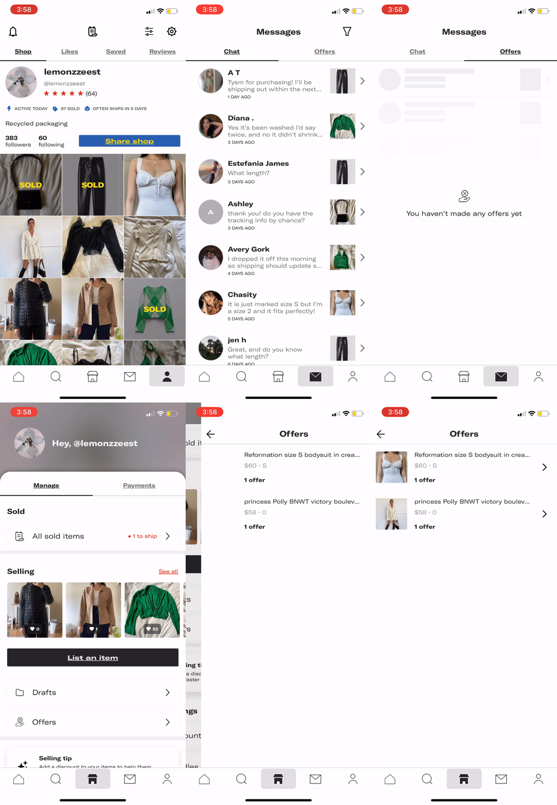
Shown to the right is a common path that 80% of interviewees took. The page that they navigated to, however, was the incorrect page.
User Research
I navigated to the messages icon first just because it was an icon I easily recognized. I pressed on Offers thinking that it would show offers people have sent me.
Even after clicking on the correct page [home page], it took me a little bit to navigate to Offers.
I don’t think Offers should be where Messages are.
Having Offers CTA far down on the current page it exists on makes Offers hard to find
Having Offers Sent vs. Offers Received in two separate locations is confusing
An offer /= a chat message, therefore Offers (both sent and received) should stay on its existing page.
FINDINGS
CURRENT UI
Iterations + Prototypes
USER FLOW
DESIGN SYSTEM
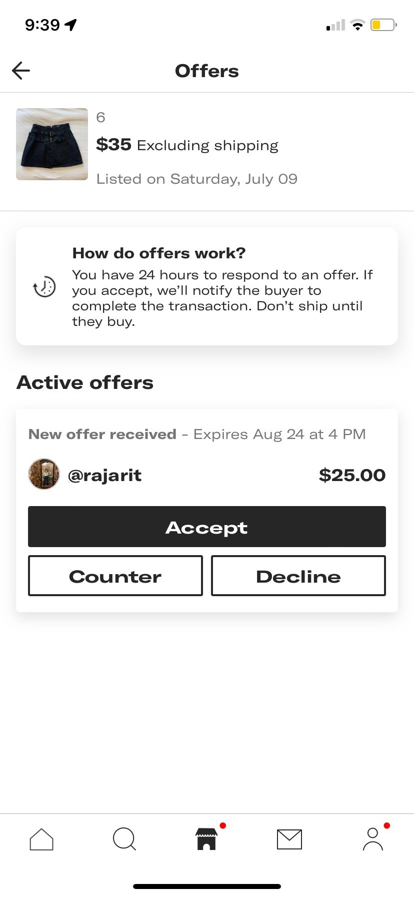
Depop’s current UI has offers received and sent in two different locations. This makes the user confused and unable to quickly interact/track all offers, which creates less overall interaction with offers. We want to increase the likelihood of a user interacting with Offers as much as possible so that there’s a higher chance of revenue for Depop.
Solution: Place offers received and sent in the same location where the user already facilitates transactions and tracking (home page). A user having clearer access to offers received and sent means increased interaction with offers which leads to more transactions being facilitated on the app.
Product Goal #1:
Increase interaction with offers sent and received
Create two different tabs which are easily seen within the Offers hierarchy and can be toggled all in one place
Include red notification icons in order for the user to immediately know how many offer notifications they have
Solution: Create new copy and display a countdown visual in order for user to quickly understand when the offer is about to expire. Use color cues connected to time (green = good, yellow = mild, red = urgent) in order to get the user to interact with the offers.
Product Goal #2:
Create a sense of urgency in Offers to review
Tell user how much time until offer expires instead of what exact time and date offer expires
Visual colored bar displaying how much time user has left to interact with offer
Sort offers in order of highest to lowest offer regardless of expiration time so that first offer = highest offer
Solution: Redesign UI in order to fit more with Apple iOS UI since most Depop users are young people who are very familiar with a modern iOS design.
Product Goal #3:
New and fresh UI to match brand + target audience
Use Apple iOS red notification circles in upper right corner in order to indicate that there are notifications within the CTA to be checked
Use soft, rounded corners and striking gradients in order to create a more modern and up-to-date UI with resemblance to modern iOS features that most app users are familiar with


