Role
Product Intern
Duration
12 weeks
Tools
Sketch, Zeplin
Team
RepairSmith Product Team
RepairSmith Internship
Context
Summer 2022 Product Intern
Overview
RepairSmith is a startup created in 2018 by Mercedes-Benz that delivers car repair to your door so that customers can spare the time and effort saved by a trip to the dealership. They employ hundreds of technicians and their services are available in hundreds of cities in the U.S. I interned with the Product Team where I worked on designing external and internal UI to improve employee workflow efficiency and customer experience. I worked on 10+ various UI projects with the largest projects being redesign for internal employee scheduling as well as a plans page to showcase our subscription plans to consumers for the launch of RepairSmith’s new service, AutoPilot.
Stakeholders
Throughout every project, I had to make sure that I was communicating effectively and updating my shareholders as well as seeking continuous feedback. I worked closely with Product Designer Renee Kim on the Product Team on every project. I also received feedback from Product Managers Lorenzo Arduino and Robert Miller. I checked in with Head of Product Amanda Kifer for any last feedback before designs were implemented.
Problem #1
The Challenge: How can we assist technicians in navigating through the various parts of the scheduling UI?
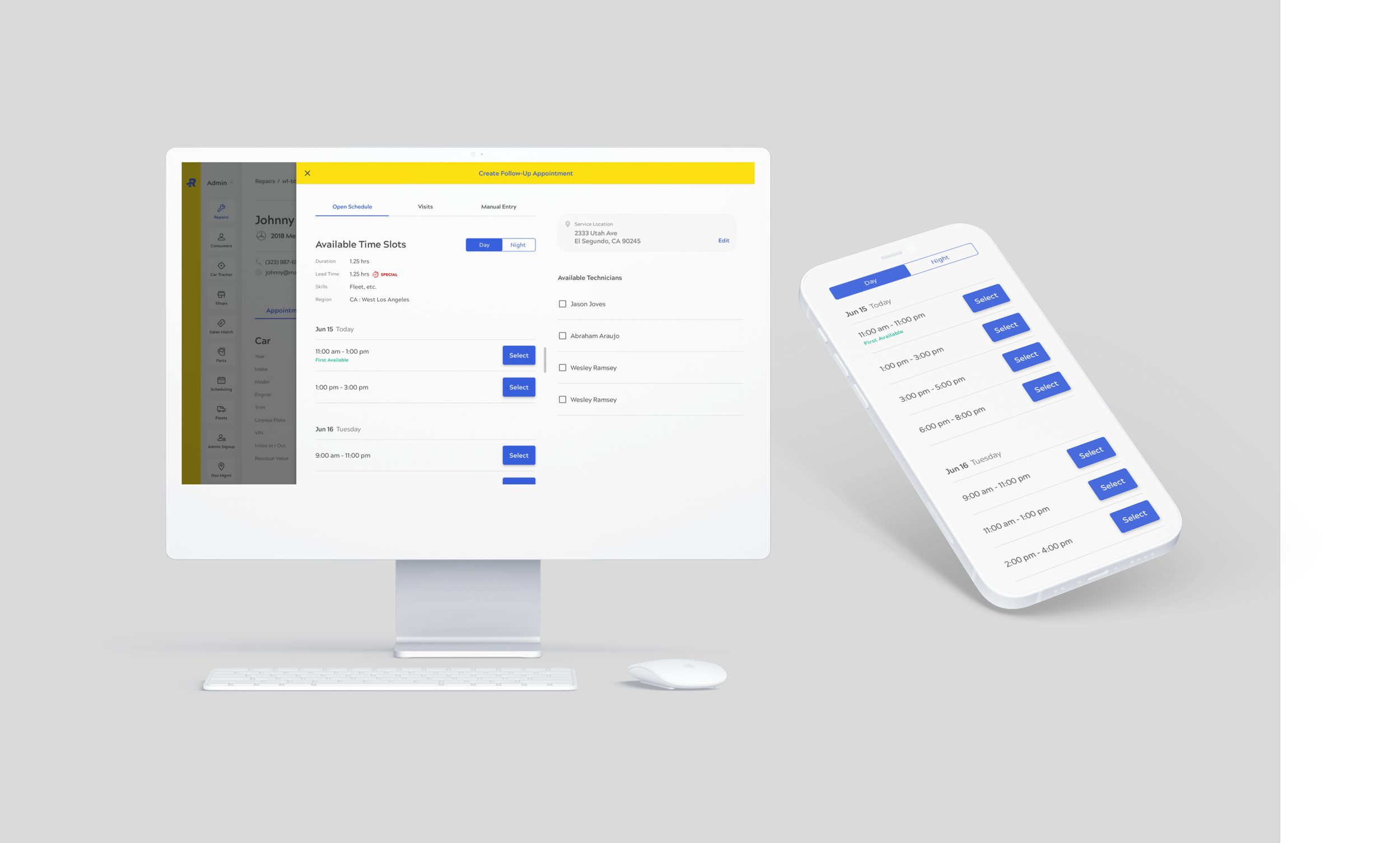
There are 3 main functions of the Scheduling Drawer that a technician can interact with: Open Schedule, Visits, and Manual Entry. Manual Entry existed prior to this redesign as a small link at the top right of the page.
INTERNAL
Original design requirements and ideation shown below
Design Process
I took 3 factors into consideration when designing for this UI:
Button style and shape
Hierarchy and overall organization
High usability for technician in both desktop and mobile UI
Button Design
A pill-shaped button usually indicates that the user can select multiple items. For this design, I knew that I wanted the user to toggle between Day/Night and Open Schedule/Visits. Not only should the two groups be grouped in different hierarchies, but the components within the groups should be easily distinguished. After doing some research as shown below, pill-shaped makes much more sense for multiple selections whereas a sliding toggle button makes more sense for two separate categories that are exclusive.
Hierarchy
Day/Night and Open Schedule/Visits lie in different hierarchies. In fact, the Day/Night toggle lie underneath the Open Schedule/Visit categories, therefore the Day/Night toggle can live within those categories. Open Schedule/Visits, however, are the highest categories that exist in this UI. When a technician moves through this UI, they should be selecting Open Schedule OR Visits before picking Day OR Night. In collaboration with Designer Renee Kim, we decided on putting the Open Schedule/Visits categories at the top and whichever page the technician navigated to would be highlighted by a blue bar underneath the section.
Mobile Compatibility
Manual Entry is what technicians use when they know the exact time and technician to schedule for (manual input) versus having an already set time. The product managers as well as the entire team agreed that Manual Entry should be accessible and easy to find for technicians. We experimented with having Manual Entry as a small link that leads to a popup, or having it as part of the Open Schedule/Visits hierarchy. Ultimately, we decided to put Manual Entry in the hierarchy for one outstanding reason: technicians are often times on their mobile device when scheduling a follow-up appointment, therefore Manual Entry needs to be easy to use on a mobile device. Having a small link (although fine on desktop) can lead to easy mistakes or a technician having to struggle to press the small link when out on the job.

Final Scheduling Drawer mobile and desktop designs
Problem #2
The Challenge: How can we display our subscription plans to the customer that will be visually appealing, easy to interact with, and ultimately guide the user to the next step?
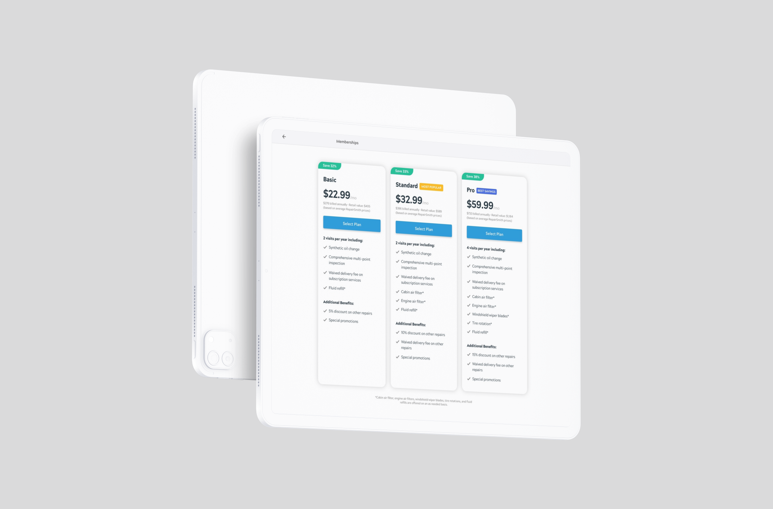
During my internship, RepairSmith launched their new subscription service: AutoPilot. AutoPilot is a yearly subscription that features three different plans that customers can choose from; each plan offers various vehicle maintenance services varying based on price. Our main goal in showcasing these plans is to get the user to press the ‘ADD CAR’ CTA in order to push them through the flow.
CONSUMER-FACING
Original mobile and desktop Plans page
Design Process
There are 4 components I considered with the Plans page:
How can I get the user to the next step in the flow?
How can I make the features of each plan viewable but not clutter the page too much?
How do I make the necessary information viewable above the fold on both desktop and mobile?
How do I make a visible distinction between each plan?
Get User to Next Step
Our main goal is to push the user to press ‘ADD CAR’ here. I made various mockups with one pushing the ‘ADD CAR’ CTA to the bottom of the page while the other kept the button at the top. I had difficulty deciding how to showcase the features and where the button would be pushed to once the user expanded the features. However, we ultimately went with the mock that preserved the ‘ADD CAR’ CTA at the top. This is because visually, the features list is quite long and might overwhelm the user. Because the user’s eye would travel downwards while reading the features list, if they got disinterested while reading, chances are that they would never get to hitting ‘ADD CAR.’ However, if ‘ADD CAR’ is at the top, then some users may be enticed to press the button because it is so easily accessible and in-view.
Features
I wanted to keep the features list viewable, but only after the user chooses for it to be viewable. This is because since our main goal is to get the user to press ‘ADD CAR,’ we want to minimize the amount of clutter/text that the user reads prior to clicking the button. Of course the features must be viewable, therefore in collaboration with my team, we decided to use an expandable/collapsable list that the user can interact with.
Working Above the Fold
We wanted to prioritize keeping the necessary items above the fold for mobile devices. Since the expand/collapse design that we chose expands vertically, we had to carefully design for mobile and keep the most important items viewable prior to scrolling. We kept the monthly price, the ‘ADD CAR’ CTA, the number of yearly visits, and the annual value above the fold because if a user is to purchase something, they will immediately go looking for the price. In doing this, we chose to make the monthly price more prominent whereas the yearly price is small and beneath the other items. This is because even though we do charge annually, the price is quite a hefty fee for a user to look at and want to add it to their cart. Because, as stated before, our entire goal is to get the user to press ‘ADD CAR,’ we don’t want anything deterring them from pressing that button so we curate the design to make the price more palatable but still available and transparent to the user.
Visible Distinction Between Plans
We wanted there to be a more eye-catching and clear distinction to each of the plans. Initially, we had green tabs at the top of the Standard and Pro plans with the percentage that each plan would save the customer in order to drive more customers to those plans. However, because both tabs were green, we decided that visually there should be more distinction between the two. We decided to incorporate a gold tab in addition to the green tab and switch the headings to “Most Popular” and “Best Savings” instead of “32% Savings” and “35% Savings.” Because there is also not a vast difference in % savings between the two, we thought that distinction based on wording rather than numbers would be optimal. We chose “Best Savings” to be associated with the green tab because green = associated with money, and we made “Most Popular” to be associated with the gold tab because gold = winner (I.e. most chosen).

Final Plans page redesign
Takeaways
Designing For The User
I learned how to design for both the customer and employee of a company. Designing for both external and internal allowed me to expand my skills in formulating user narratives and designing for the specific user.
Technical Skills
This opportunity made me much more comfortable working with applications like Sketch, Jira, and Zeplin. I collaborated with designers, product managers, and engineers across these platforms and became skilled in using these tools in collaboration with my team.
Engage With Your Team
During my internship, the Product Team had a bi-weekly team building exercise that usually involved playing a game. I took advantage of this opportunity to grow more of a personal relationship with my coworkers and this resulted in me feeling more comfortable in taking initiative to reach out and ask for help or feedback (which ultimately results in a healthier workspace). I still keep in touch with my team, and I learned that taking time to build meaningful connections in your workplace is key to enjoying your job.


