
Overview
Timeline 7 weeks (UCSD DSGN 100 course) + 2 additional weeks
Team Abby Han, Peony Lum, Jackson Young, Brianna Fredeluces
Roles UX/UI designer
Background
With COVID-19 disrupting our lives within the last few years, our relationship with social media has shifted. Users are spending more time on social media and mental health in general is worsening due to lack of social interaction and routine. Instagram in particular is a target culprit for the worsening of our target audience’s mental health during the pandemic due to factors such as comparison. In our questionnaire and interview, we asked users about various social media platforms and kept the discussion open before ultimately deciding we wanted to focus our design around restricting Instagram.
Challenge
How do we mitigate the negative mental health effects of Instagram while still encouraging users to keep their account? How do we preserve connection that users feel from Instagram while lessening how often users negatively compare themselves to others?
Preliminary User Research
— Questionnaire
We crafted a short questionnaire through Google Forms which asked about the person’s identity (age, gender, employment status, etc.) so that we can find trends within various user groups. We then asked multiple choice questions regarding the user’s time spent on social media before and during the pandemic, their affinity for various social media apps, and their mental health status before and during the pandemic. We also included a few fill-in-the-blank questions to gain further insight into the reasons for the user’s favorite and least favorite social media apps.
— Interviews
We followed the questionnaire by conducting 15-minute interviews with people in our general target audience (young adults who currently use social media). We asked open-ended questions that prompted the interviewee to talk freely about their role that social media has had on their mental health during COVID-19 as well as in a general sense. We also inquired about how the pandemic has affected them in general. Through this, we aimed to draw observations and connections between mental health, the struggles of the pandemic, and social media.
User Research Takeaways
01. Comparison is the thief of joy
“I used to (and still) compare myself to most of my friend’s Instagram profiles, seeing the kind of life they are having even during the pandemic due to the amount of extra time they had. This ended up with me getting distracted during online classes, too.”
02. Social media is too time consuming… especially when there’s nothing else to do!
“I am too ‘addicted to social media’ in a sense that I always care about whether or not people think about me or reach out to me; I don't particular like social media but still check it for a few hours a day.”
03. Social media is still useful for connection and to “stay in the loop”
“Social media had an overall positive impact because I was still able to communicate with people even if it is not in-person, so it’s made me feel more connected during the pandemic.”
Personas
After analyzing our user research, we decided to hone in on Instagram because we saw that it was the most polarized and mentioned app in our questionnaire and interviews pertaining to connection and mental health. We created two personas based on our target audience with contrasting relationships with Instagram to provide a more holistic view of a typical user.

Sketches
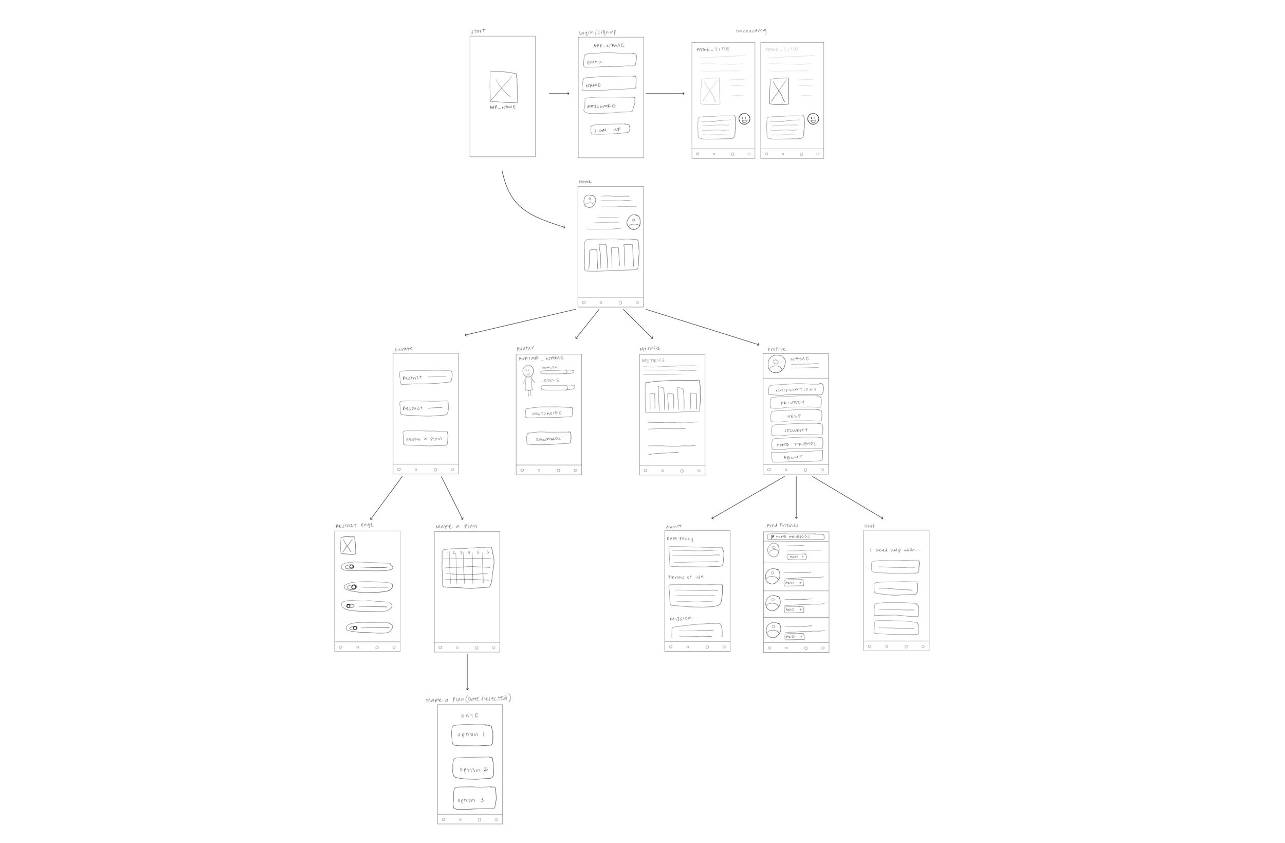
Our initial sketch included a general flow of what we expected the app to look like. The start page would eventually take the user to the homepage which would walk the user through how to use the app and navigation bar. From the navigation bar, there would be a Curate, Avatar, and Metrics, and Profile page.
Design System
We wanted to create a style guide that encapsulated the words “zen” and “peaceful.” Zengram is supposed to be a space where the user feels calm and relaxed in contrast to the noisy and chaotic environment that Instagram can oftentimes create.

Final Design
(coming soon — still in the process!)
What I Would Have Done Differently
— Conduct more thorough user research in the interview phase
Although we asked good questions pertaining to the problem we were trying to solve, we often times got the same answers (but more detailed) than the questionnaire. Next time, I would tweak the interview questions to give us a lot of new information based on the information we received in the questionnaire. The whole purpose of a questionnaire plus an interview user research round is to create new findings and build off of observations.
— More insightful usage of the homepage
We crafted our homepage to give a holistic view of the app such as stats and friend updates. However, one of the key aspects of our app is the Avatar. We placed the Avatar in the navigation bar in order to give the user easy access to a key function of our app. One piece of feedback we received from our professor was to think about the placement of this function. Usually, homepages are supposed to be the all-in-one access to everything important within the app. Therefore, if we wanted our homepage to truly reflect this, the Avatar could actually live within the homepage.
— More user research (always!)
The user research for this app was conducted within the span of 2-3 weeks. Ideally, I would want to have collected much more data in both the questionnaire and the interview stages, however I acknowledge the time limitations of this design.
Takeaways
— Figma
This was my first time (and my teammate’s) doing a UI/UX project. I learned how to use many functionalities on Figma as well as conduct user testing.
— User research
Although I would have done some things differently in our user research, I got more comfortable with interviewing and sending our questionnaires as well as analyzing the responses.
— UX/UI project flow
This project made me understand the timeline, collaboration, and flow of a UX/UI project. From user research, to problem-solving, to UI design, I gained a ton of new knowledge of the design process.